Aktivierung durch User Onboarding
Vom Papier-Prozess zu 86% Feature-Adoption

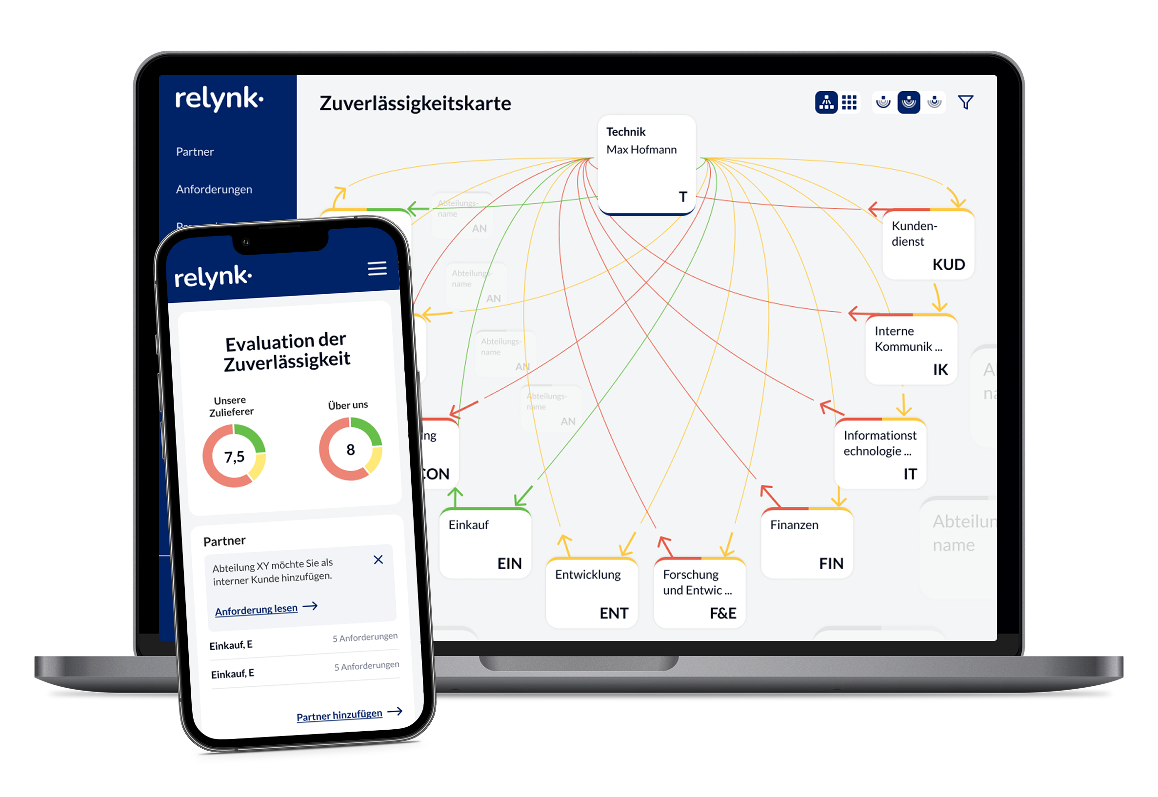
At a glance
Industry:
Management Consulting
Duration:
3 months
Services:
The Project
The goal was to digitize the previously time-consuming, paper-based process of tracking internal collaboration and integrate it into employees' daily workflows. Key metrics included active daily usage, which we achieved through personalized user onboarding and simple, quick tasks for employees to complete.
About Relynk
Relynk translates internal collaboration between employees and teams into clear management metrics for mid-sized companies and large corporations alike. For over 20 years, founder Prof. Dr. Andreas von Schubert has been researching ways to improve corporate interfaces. The focus is on increasing employee satisfaction while saving companies time and money through better collaboration and clarity regarding interdependencies.
The Challenge
MVP paper template
Every piece of feedback, every rating, every supplier card—everything was on paper. To digitize the MVP, we first had to work with the team to determine which workflows truly needed to be digital first, and which could wait.
Skepticism & Resistance
A new tool is easy to explain, but rarely adopted with enthusiasm. The concern in companies: yet another application that costs time instead of saving it. Relynk had to prove itself—through speed, clarity, and value that is apparent from the very first use.
No overview for leadership
A glance during strategy meetings should be enough to identify problem areas and highlight positive developments—without having to dig through stacks of paper or Excel spreadsheets.

Our Approach
To deliver the MVP on time, we set clear priorities with the CEO and the development team: the most essential features and daily user activation as the foundation for reliable data.
Research & Concept
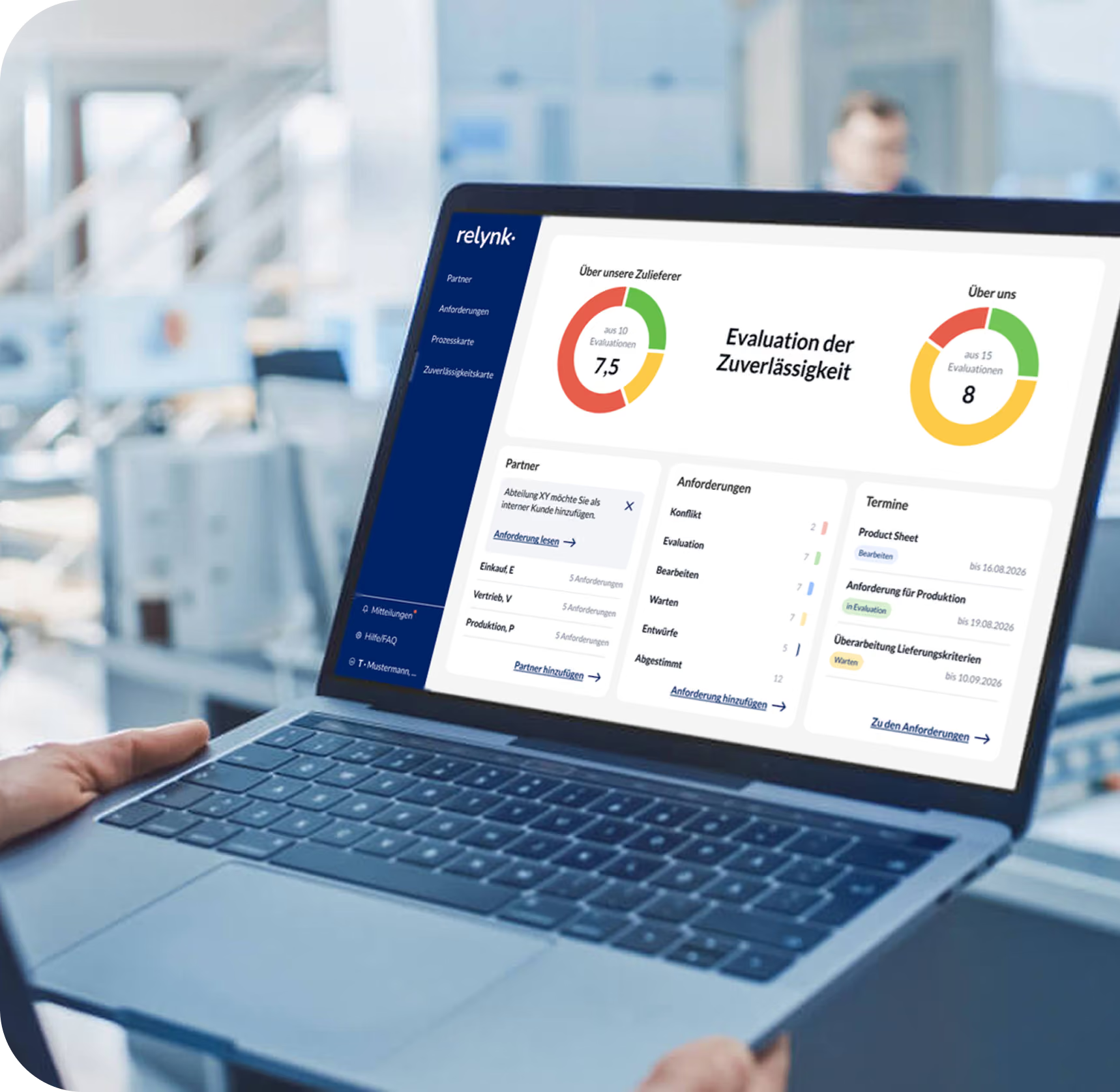
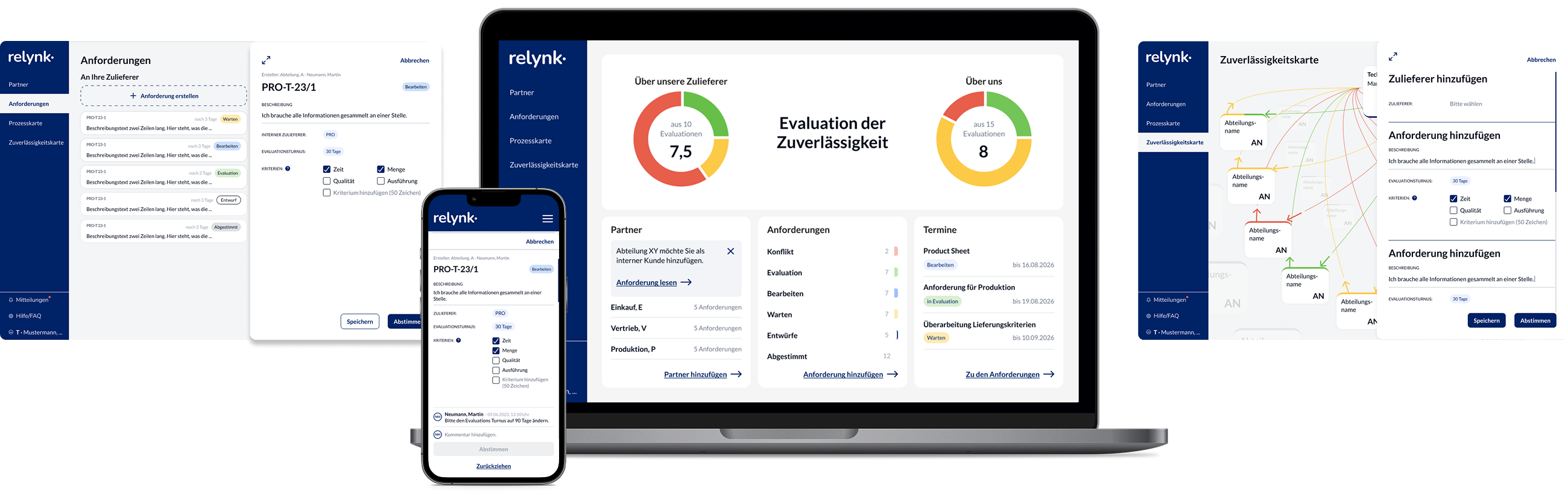
An offline product needed to be digitized—without an existing interface concept and for two very different user groups. CEOs required a quick high-level overview of problem areas, while employees needed to work within the application efficiently and, most importantly, daily to provide reliable data. The key decision: the dashboard would serve as the starting point, using gamified elements to visualize progress and status—acting as an incentive to return.

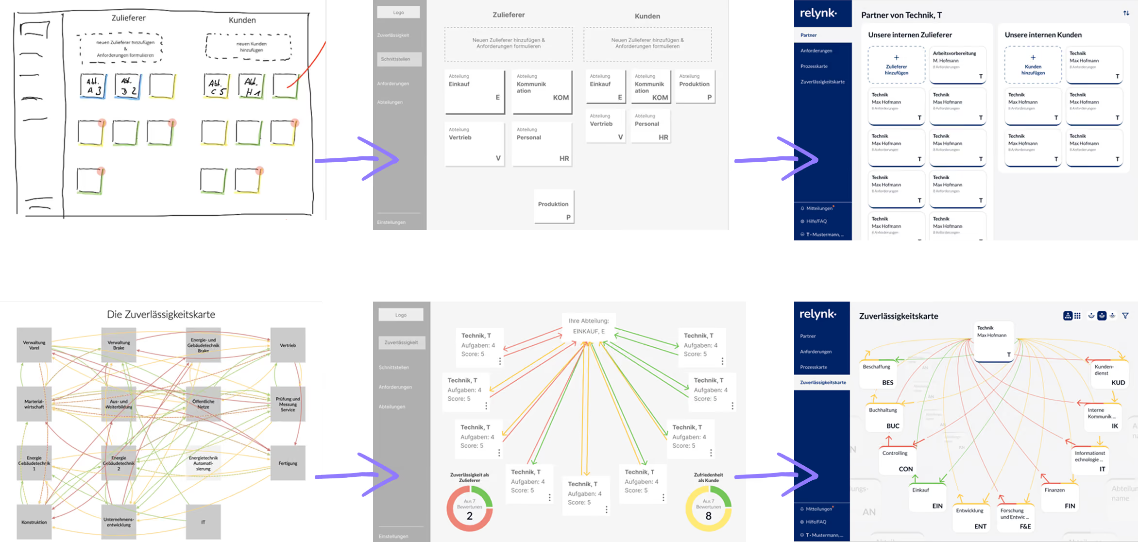
Prototyping & UI Design
From the user journeys, we developed wireframes that we iteratively refined into prototypes, ensuring stakeholders had a precise understanding of functionality and user experience early on. For the UI design, a competitive analysis pointed toward a modern, clear, and minimalist aesthetic. We visualized the status of the collaboration using traffic light colors—deliberately avoiding a broad color palette to keep the focus on the evaluation results.
Activation & Motivation
Based on UX psychology, we identified the steps that new users needed to understand and implement immediately. A visible, mandatory checklist guided them through the most important tasks with a clear sense of progress, while situational tooltips provided targeted support without being overwhelming. The traffic light system from Step 2 found its true purpose here: it creates the desire to be "in the green," complemented by subtle notifications that encourage daily engagement.

Research & JTBD Interviews
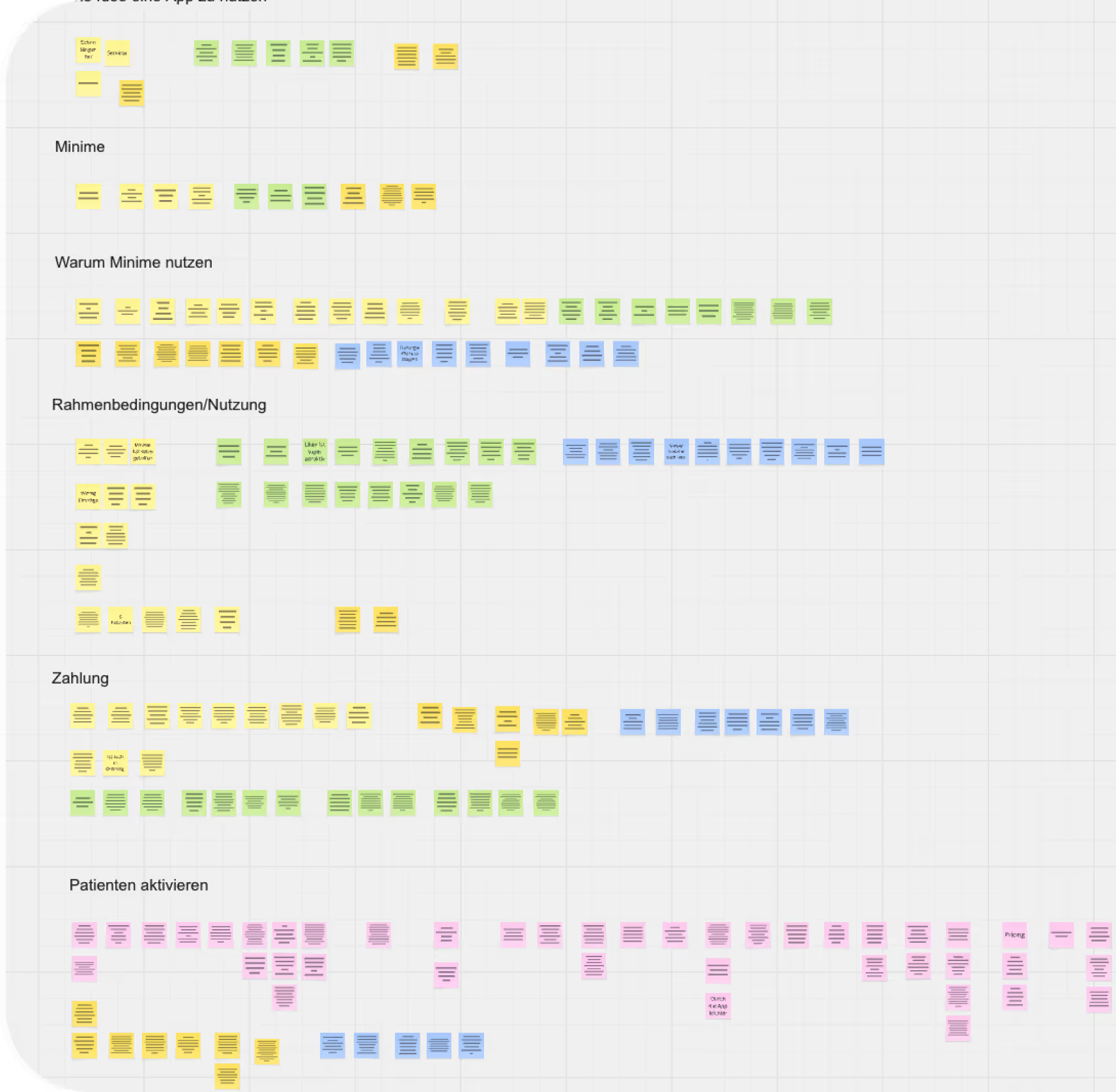
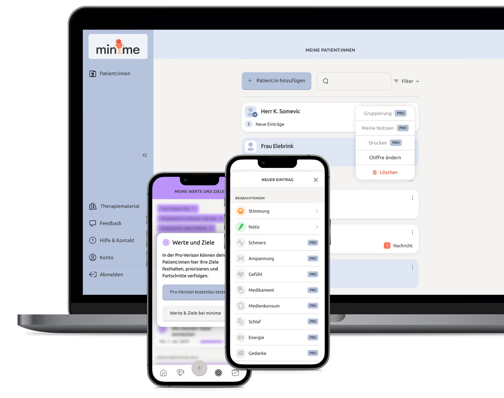
Through our interviews, we gained a deep understanding of user needs: patients require clear goals to stay motivated and actively integrate the app into their daily routines. Therapists, on the other hand, need more support and a personalized onboarding process to use the app effectively. This approach specifically strengthens the collaboration between both groups.
Strategic Realignment: Product-Led Pricing Model
We developed a freemium model that is visible and intuitive for therapists at every relevant touchpoint. Feature segmentation was clearly structured: the free trial focuses on a few core functions, while the previously confusing "sandbox" was removed.
Gamification & User Onboarding
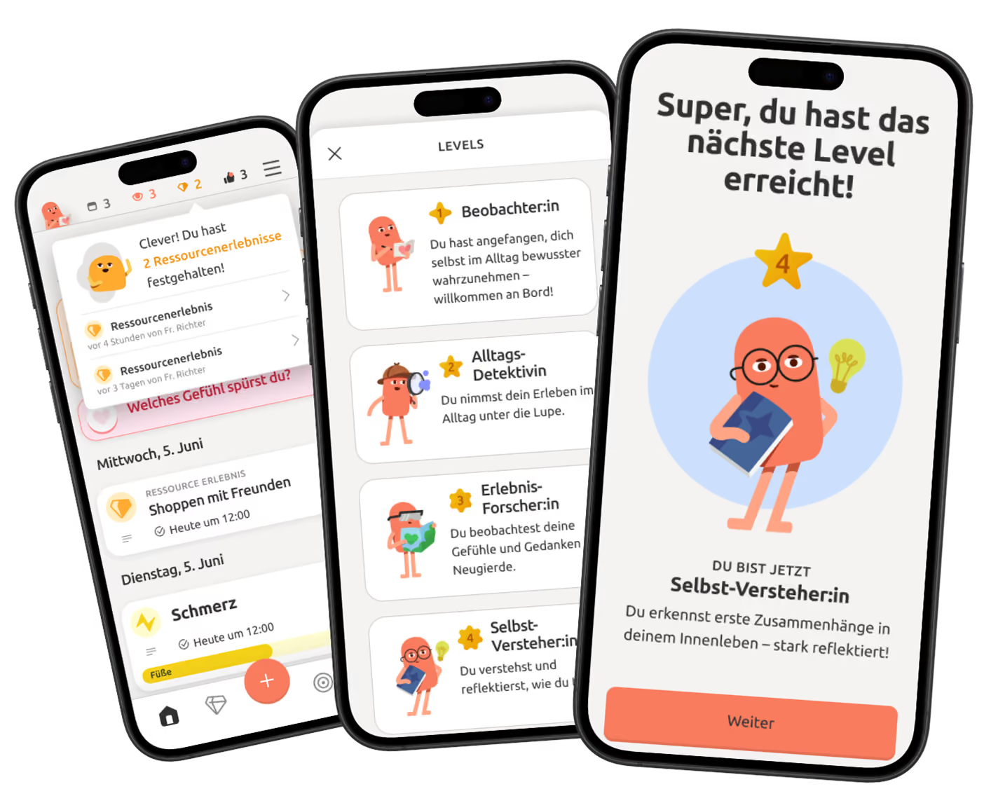
A redesign featuring a mascot, checklists, and videos makes getting started easier for both patients and therapists. Subtle gamification elements like progress bars and achievements boost engagement without compromising medical professionalism.
See for yourself
Solution
Iterative collaboration with rapid testing and optimization provided the necessary flexibility to develop this innovative product. Focusing on user activation and onboarding was the key lever for achieving our business goals.
Results
Project completed in 3 months – including a UI design system, development support with quality assurance, and concepts for future growth. The results: 5 usage sessions per week, a time-to-value of 1.5 weeks, and a feature adoption rate of 86%.
“The design language is one of the essential keys to Relynk's success. And all that in just 3 months.”
